This blog shares some of our thoughts about plain language, and the latest discussions about plain English and clear design in New Zealand, and around the world.

To find out more about Write, go to http://www.write.co.nz/ or join us on Facebook at http://www.facebook.com/WriteLimited

17 October 2013

I hope I've done the right thing

We attach the word ‘literacy’ to many areas of information in the new century—food, media, computers, health. ‘Financial literacy’ is an important term to know and important skill to have for people like me approaching retirement.

Today I phoned a financial organisation to take out my small investment. My adviser had told me to use the word ‘repurchase’, so that I got the money by cheque. When I phoned the organisation, the person who answered the phone refused to use the word ‘repurchase’, and said I must want to ‘redeem’ or ‘withdraw’ the money. He’s sending a form. I hope I’ve done the right thing.

Post written by Rosie Knight

12 October 2013

PLAIN 2013 Conference enlightens and inspires

What a privilege to be in Vancouver for the PLAIN 2013 Conference as hundreds of plain language practitioners and supporters from 19 countries commune. Or if the predictions of Neil James in this morning's plenary come true, we'll be plain language practitioners no more. We'll redefine our somewhat fragmented, multi-disciplinary profession as 'clear communication'. Our various disciplines from writer or editor to information designer, technical writer, or usability consultant (did I forget any?) will converge. No more problems describing your profession at those pesky school reunions.

In the second plenary, we heard the latest news about IC Clear from Karine Nicolay. Soon you'll be able to enrol in an international post-graduate course in clear communication.
Read about IC Clear

World Cafe followed, with 20 topics to choose from for a series of interactive roundtable discussions. We conversed through three topics for 20 minutes each. The themes of the ones I chose were: achieving long-term change, embedding clear language principles and practice within an organisation, and selling the need for plain language to management.

Legal language in legal aid and pro bono projects was the topic for after lunch. The country is different (the Canadian experience), but the problems are the same. Then an entertaining session of time-saving tips with Marcia Riley of Write Like a Pro fame before Josiah Fisk (More Carrot) delighted us with his maxims for messages and meta-messages, presented in his wonderfully visual way and timed to a tee.

The keen ones (most of them, I think) stayed on for the late shift when Sarah Stacy-Baynes and I presented together on the Cancer Society's project to rewrite their information booklet on lung cancer.

Looking forward to more inspirational stuff tomorrow.
Read more about PLAIN2013
10 October 2013

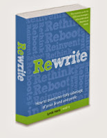
Our book about transformation: 'Rewrite — How to overcome daily sabotage of your brand and profit'

Image of the cover of 'Rewrite - How to overcome daily sabotage of your brand and profit'
Rewrite — How to overcome daily sabotage of your brand and profit highlights the tremendous cost of bad writing in business and government, and offers a practical solution.

Words have a price. Transforming the way your organisation writes can transform the way it performs. Aligning your voice with your brand has the power to enhance your bottom line, whether that’s social good or profit.

Lynda Harris, Write’s chief executive, has written the book about many of the organisations she has seen transform their writing culture.

Rewrite is a practical handbook for anyone who understands the price of words — CEO’s, board members, communications managers, and plain language practitioners. Adapt the Rewrite for Change™ model, follow steps on the plain English pathway, and use tips for success to transform the voice of your own organisation.

Preview and pre-order

Rewrite — How to overcome daily sabotage of your brand and profit goes on sale early in 2014. Meanwhile you can read a sample chapter and pre-order a copy.

Pre-order a copy of Rewrite — How to overcome daily sabotage of your brand and profit

Download a sample chapter — How Statistics New Zealand gave its numbers a voice

Visit the Rewrite website


Read stories from people at the plain English coalface

The book describes how organisations in the commercial, professional, not-for-profit, and public sector changed their voice.

Senior managers from each organisation describe their motivation for change. They explain how they got buy-in, laid the foundations, overcame obstacles, and kept momentum going. Each talks about their own approach for turning around the skills and attitude of its writers. And they tell how they’ve reaped the benefits of a plain English culture.

03 October 2013

02 October 2013

A happy story about accessible banking

A while ago, my banking website told me that it was getting a makeover. The big day arrived and… oh dear.

It looked horrible — depressing grey text, tiny and narrow, on a pale grey background. My eyes strained to read it. I asked around the office and everyone agreed that at its default setting (the size of the text when you first open the website), it was difficult to read.  That’s an accessibility problem… and my only disability is ‘middle-aged eyes’.

I complained, and it worked!
So I got on my high horse and complained about the accessibility problems. People with poor vision struggle to read when there’s little contrast between the text and the background. And a narrow typeface is usually harder to read than a wider one, for all readers. The individual letters are more indistinct.

And the good news? I wasn’t the only one to give feedback. This message now appears on the bank's login page:

'We have made some improvements to our internet banking. These improvements will make internet banking easier to use as we feature better colour contrast and text that is easier to read.

‘Thank you to everyone who sent us suggestions to improve our internet banking. We’ve taken this feedback on board and will continue to make improvements.’


Is ‘cool’ overcoming ‘clear’?
The trend for ‘cool’ grey-on-grey is spreading. Look at the new iOS7 operating system for the iPhone. Here's a screenshot of the timer. It looks fantastic, but it has me squinting through my specs. Thank you, Co-operative Bank, for putting readability ahead of design. Now would everyone else please follow their lead?